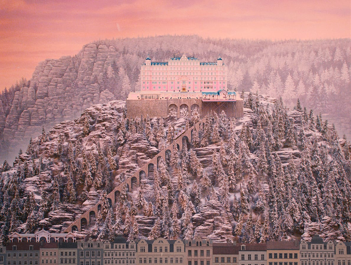
The Grand Budapest Hotel (2014). Film still on the Criterion Collection film page. Cinematography: Robert Yeoman.
A purple uniform and a pink building will get a picture recognised as vaguely Wes Anderson-like. The edges of the picture are less likely to make it onto the mood board. In The Grand Budapest Hotel, they deserve a place near the top.
The film moves through different periods, and the frame changes proportion with them. The 1930s story uses the relatively square 1.37:1 shape; the 1960s stretch into a much wider frame. The later framing sections use another proportion. Criterion lists all three ratios. These are changes to the space in which the film can arrange people, rather than optional borders around the same picture.
There is a practical pleasure in thinking about the narrower frame. A standing person takes up more of it. A doorway can surround that person without leaving a great deal of spare wall on either side. Stack a head, a hat and a sign vertically and each can join the joke. Two people side by side have to negotiate the available width. The frame makes those choices consequential before anyone has settled on a shade of pink.
Robert Yeoman described having to rethink composition for 1.37:1 at a 2015 NAB session. It is a lovely practical correction to the idea that an Anderson image happens when somebody finds a symmetrical room. The room still has to be photographed. The position and size of the figures determine whether the symmetry feels ceremonial, ridiculous, cramped or briefly reassuring.
Then there is the hotel's colour. Purple uniforms separate the staff from their surroundings while making them look as though they belong to a carefully managed organisation. Pink can appear sweet, theatrical, expensive or faintly implausible. The surrounding colours, costume and performance help decide which reading arrives first. There is no need to settle the whole matter by declaring pink innocent and purple luxurious. Hotels already have quite enough rules.
The shift into the later hotel changes the comparison. Empty space and tired decor can register because another version of the place has been established. A palette is doing work across time. An isolated attractive frame cannot show that relationship, however lovingly it is saved to a reference folder.
The making of the hotel offers another useful complication. Yeoman explained in American Cinematographer that the production used a former department store in Görlitz. The art department transformed it, and the cinematography team maintained soft light through the skylight during winter. The apparent unity of the place came from architecture, paint, practical lamps, costume and controlled illumination working together.
That is a fairly crowded authorship for a look that is sometimes reduced to a filter. Production designer Adam Stockhausen and costume designer Milena Canonero belong in the conversation alongside Anderson and Yeoman. A colour grade has more to work with when those decisions are already present in front of the lens.
The frame's changing shape keeps bringing the thought back to storytelling. We are being given an account of a place through other people's accounts. The hotel is remembered, described and passed on. Its proportions help distinguish those layers without asking a character to keep announcing the year.
The pink facade remains a very good pink facade. But once the frame changes, the film has changed what can fit around a person, how far away another person can seem, and how much of the hotel is left to surround them. There is considerably more going on than a pleasing arrangement of luggage.