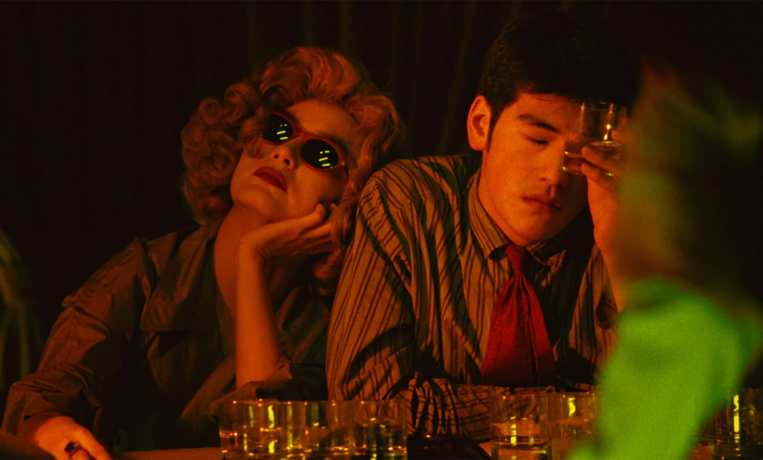
Chungking Express (1994). Film still on the Criterion Collection film page. Cinematography: Andrew Lau Wai Keung and Christopher Doyle.
Waiting for someone can produce an extremely odd relationship with time. A few minutes become available for detailed inspection. Other people seem to be getting through theirs at an entirely reasonable speed, which is not always helpful.
Chungking Express gives this mismatch a visual form. Wong Kar-wai's 1994 film can feel crowded and hurried, then unexpectedly suspended. Motion smears; certain instants appear to hang on longer than they should. The city and the person occupying the frame do not always seem to be having the same afternoon.
It helps to separate two things that often get bundled together as the Wong Kar-wai look. A camera can record fewer frames per second and give each exposure more time to gather movement. Step printing repeats recorded frames. Repetition makes motion arrive in held pieces; blur gives each piece a trace of what moved during the exposure. These choices can be combined, but they are not interchangeable. The technique is explained with frame comparisons by cinematographer Gray Kotze.
This is quite different from simply making a sequence play in smooth slow motion. Smoothness lets us examine a movement more continuously. A repeated, blurred frame can interrupt that continuity. The eye keeps trying to catch up with the next clear moment.
Colour has something equally physical to do. In the bar image reproduced by Criterion, the two figures are pressed together across the frame. Amber light covers faces and clothing; green reflections appear in the woman's dark glasses. A soft green shape occupies the foreground on the right. It partly gets in the way, which is rather the point of looking at it closely.
Take that foreground blur away and the figures become easier to inspect. Leave it there and the room seems to continue between them and us. The camera has a position among things. It hasn't been granted a perfectly clear view just because the characters are interesting.
This is why copying a green-and-orange palette only gets partway towards the image. There is also proximity, obstruction, the direction of the faces and the difference between a sharp shirt pattern and an indistinct object. The colour changes character depending on whether it is on skin, trapped in a reflection or spread across something out of focus.
There were two cinematographers. Christopher Doyle's BFI interview distinguishes Andrew Lau's work on the first story from his own on the second. Doyle also describes adapting to the busy locations and what was available there. That account leaves welcome space for contingency in a film whose appearance is now so frequently treated as a reproducible recipe.
A technical explanation can make the image more interesting without making the characters less mysterious. Knowing why movement breaks up doesn't settle what a glance means, or tell us whether two people are about to understand each other. There are still people involved, which tends to complicate even a very well-organised diagram.
Perhaps the useful thing to keep from this film is a question about tempo. How quickly is the surrounding world moving, and how quickly does this particular moment feel? The answer can change within the same shot. A colour swatch, however handsome, will have trouble showing that.